
21st.ai
Design system refactoring and new feature development for 21st.ai — a SaaS platform helping corporate boards run efficient meetings, manage documents, and make better strategic decisions.
Project snapshot
Timeframe
Sep 2023
↓
Jun 2024
Goal
Ship production-ready features, fix design system debt, and improve onboarding — preparing MVP for public launch.
Deliverables
↗ Design system audit + refactoring
↗ Meeting management improvements
↗ User onboarding flow
↗ Personal Dashboard
↗ My Documents library
↗ AI Web Scraper + Industry Catalog
↗ Mobile version
↗ Website refinement
Toolchain
- Figma - prototyping and hi-fi screens
- Google Meets - interviews and testing
- Clickup - project management
My role
- Led design system audit identifying inconsistencies blocking frontend velocity
- Refactored Figma files using atomic design methodology and design tokens
- Conducted user interviews with focus group to validate MVP assumptions
- Designed and tested 7+ new features using Wizard of Oz method
- Delivered dev-ready prototypes with component annotations reducing handoff friction
- Supported implementation with staging environment QA reviews
🌱 Discovery
The problem
Ineffective corporate management can significantly increase overhead costs.
Important decision-making in companies may be delayed, weak, and risky, harming strategic alignment and shareholder value.
The lack of easily accessible financial data, reports, strategic documents, and follow-up on board meeting tasks can lead to harming company performance and shareholder value.

The context
21st was in its private beta release with MVP features. A focus group of companies within the product owners' and stakeholders' network was continuously testing the product.
The lack of easily accessible financial data, reports, strategic documents, and follow-up on board meeting tasks can lead to harming company performance and shareholder value.
Product’s main goals:
- reduce onboarding friction for new users,
- enhance collaboration and communication,
- create an accessible interface.
The technical challenges we faced included appification, as the product was initially implemented for desktop devices.
💡Ideation
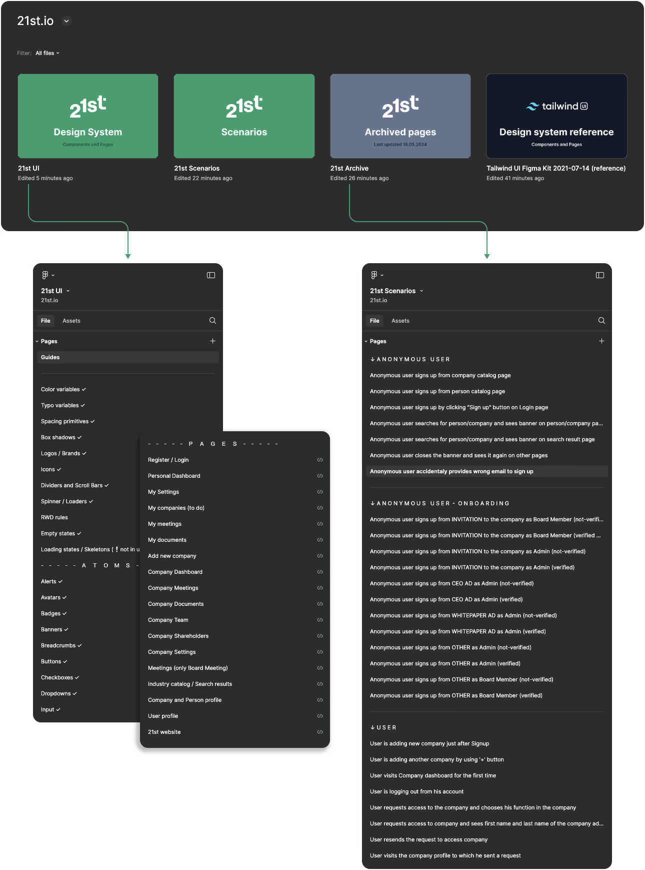
Design System audit
At the beginning of my work, I inspected the Figma files and components organization. The issues I noticed which was also reported by the front-end developers were:
❌ general inconsistency in styling making it hard to follow during implementation,
❌ contextual elements was scattered across various pages without clear structure,
❌ detached instances of major components, lack of proper naming.
I recommended the global refinement for design files:
✅ fix the existing components,
✅ prepare new components for individual properties,
✅ refine styles and add variables (colors, typography, etc.),
✅ adjust component organization according to the atomic design methodology,
✅ start using design tokens based on Figma variables feature,
✅ review and fix all major pages.
I implemented a refined design system structure over two weeks, with ongoing expansion of components at all levels.
Feature improvements
The product team had already identified several improvements and planned them on a development roadmap.
My role was to:
✓ conduct interviews to gather more insights and validate ideas based on MVP,
✓ propose the optimal order for delivering the improvements,
✓ ensure the requirements met our focus group's real needs,
✓ prepare and test the prototypes for major scenarios,
✓ handoff designs for implementation and support developers.
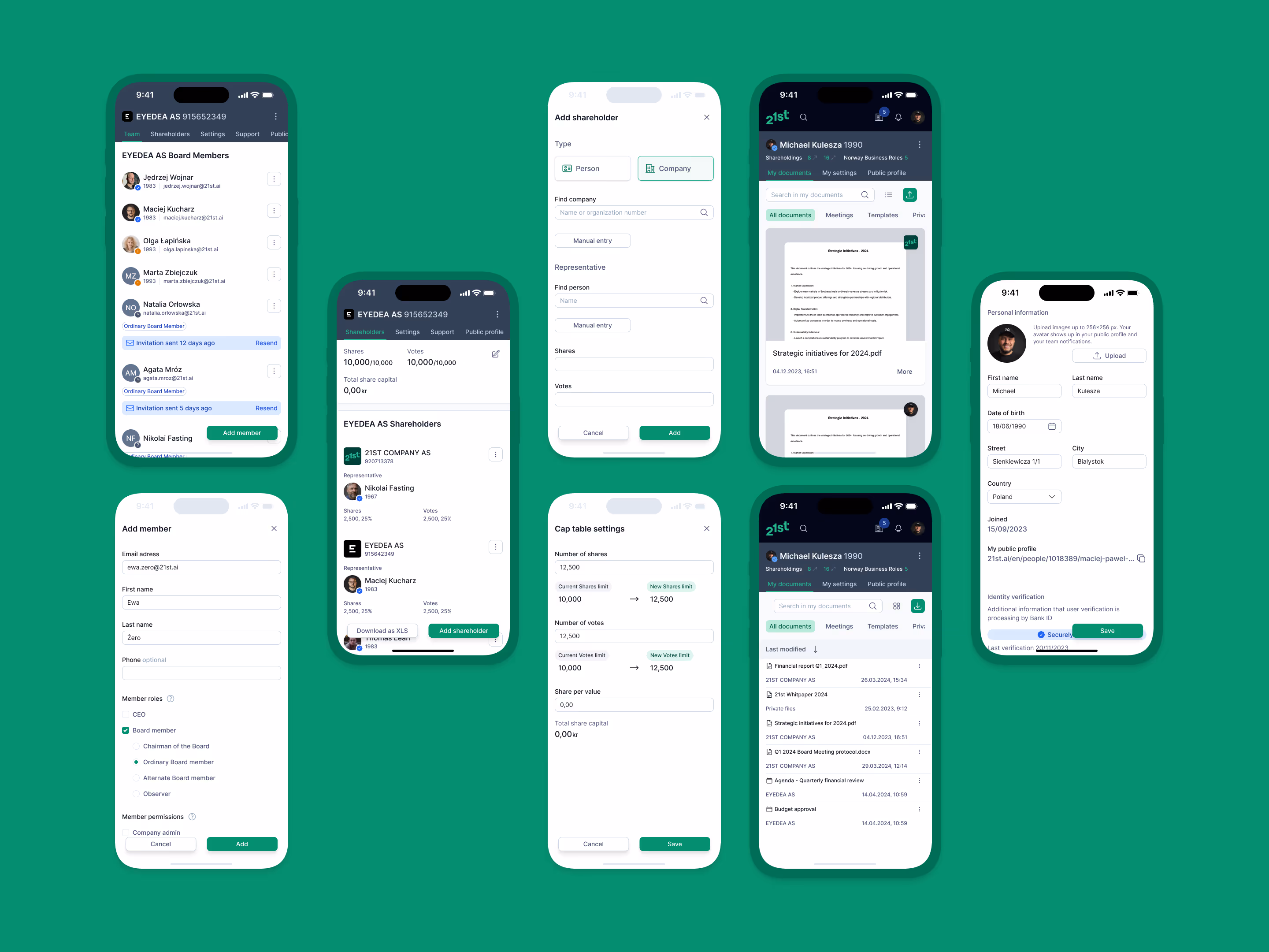
Meetings (key feature)
creating custom meeting agendas,
managing attendee invitations,
refining layouts with other UX improvements.
User Acquisition
streamlining the verification process to reduce bounce rate and optimizing the account creation flow.
Company Dashboard
fixing consistency,
refining layout with other UX improvements.
Website
general refinement tailored to business requirements.
Designing new features
Our product growth strategy focused on delivering the most valuable features and improving accessibility.
The new functionalities included:
Personal Dashboard
a new, initial space for users necessitated by the expanded 21st information architecture.
My documents
a comprehensive library to house all documents and assets from new features.
Onboarding
a product tour for new users.
AI Web Scraper and Industry Catalog
enhanced search capabilities,
industry catalog,
generation of unique content for company profiles.
Mobile Version
general improvements for responsiveness,
design all missing mobile pages.

⚡️Execution process
Lo-fi prototyping
In the initial design phase, I created low-fidelity prototypes to rapidly test and validate ideas. This involved sketching, wireframing, and designing flowcharts for complex features.
These prototypes served as discussion starters within the product team and could be easily upgraded to more detailed versions for user interviews if needed.
High-fidelity prototyping
High-fidelity prototypes are organized into distinct scenarios, representing comprehensive user flows. These scenarios outline all possible user actions, providing a structured view of feature functionality.
For each feature or improvement, we maintain an evolving list of scenarios to ensure thorough coverage.
Designs
A showcase of the 21st interface, highlighting its key features and overall aesthetic.


📋 Validation
User tests
We conducted remote usability tests using the Wizard of Oz method, where each session started with an overview of test scenarios and context.
I shared my screen showing only scenarios, without describing flows. Participants were asked what they'd do next at each step, encouraging real-time insights. This approach yielded rich qualitative feedback, surpassing typical survey results.
This testing method was chosen to gain early insights before committing resources to potentially risky development.
Results analysis
During internal UX sessions, we revised and updated scenarios based on test results. For failed tests, I created refined versions addressing identified issues and validated them with the product team. We tracked pain points and success metrics for subsequent testing rounds.
Iterative process continued until all major usability issues were resolved.
Dev-ready designs
After refining the design system, I maintained all files in an organized, well-structured manner. This approach made the design system easier to navigate and follow, while maximizing reusable components to streamline development processes.
Each dev-ready component, page, and full scenario was marked and assigned to its related ticket, with annotations added when necessary.

Testing and review
The implemented version was tested in the staging environment within the product team and our focus group, allowing for easy bug reporting. I inspected the implementation for any development inconsistencies. This was an iterative process as well. I supported the developers whenever design changes were needed.

Outcome
Delivered production-ready design system with Figma variables and atomic structure, reducing frontend implementation time. Shipped 7 new features including AI-powered company search and mobile version. Usability testing with focus group achieved validation before development commitment, minimizing rework.
Reach out me directly if you want to discuss a similar project
↘
Fighting design system chaos?
Product Designer
Michael Kulesza
Let's talk!
Pick a slot!
3000+ active users
⊹
AI-powered

2024
·
product design
08
DigitalFirst.ai
Improvements and AI feature development for marketing strategy platform
4 products
⊹
Brand → MVP

2020-21
·
Internal MVP's
07
Silevis ventures
Internal product initiatives from brand workshops to MVP delivery